Although I’ve become a pretty strong Mac convert (both at home and at work), I recently took the opportunity to play around with Windows 7 for a few hours. Although Microsoft as a whole fails to impress me these days, there is still a small soft spot in my heart for Windows. I was especially interested to see what kind of user interface improvements were added to this version; Vista was pretty lacking in that department.
Immediate Thoughts
- Installation was painless and quick
- User Account Control doesn’t bother you every few mins. Woohoo!
- For once, most of the built in themes look nice
- Ugh… the sound effects are rather awful
- Glad to see the widget sidebar go away (you can still add widgets anywhere)
The Taskbar
The new improved taskbar is easily the star of Windows 7’s UI — a much needed upgrade of an ancient feature.
Microsoft has obviously taken some cues from Apple as this new improved taskbar resembles the OS X dock in a number of (good) ways. The most obvious change is that running apps all show up as an icon without a title. Apps can be “pinned” so that they stay on the taskbar even when the app is not running. Running apps are each subtly highlighted. And you can (finally) reorder running apps by dragging them. Doesn’t this all sound familiar?

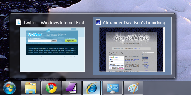
The smaller size of each app makes the taskbar better suited for running many apps at once. Also notice that windows that stack are visually represented (in the image above IE has two tabs open). Subtle yet effective!
I was quite impressed with the hover popup for Internet Explorer (see image below). This is arguably more intuitive than Snow Leopard’s exposé because you don’t need to click and hold — you just hover. And you can navigate right to a particular tab within that app (although it isn’t supported in Chrome or Firefox at the moment if ever).

Another minor but welcome Mac OS X influence to the Windows 7 taskbar is the monochrome system icons in the tray.

Other Stuff
The new Aero Snap is interesting. Basically dragging a window to the top of the screen will maximize it. Dragging it to the left or right edge of the screen will cause the window to take up that half of the screen. Dragging away restores the original size. I was worried that this feature would be cumbersome but in fact it works pretty well.
The usability key here is that it doesn’t trigger the snap when the window touches the screen edge. It happens when your mouse cursor hits the edge (and to make this “magic” more evident to the user the mouse pointer glows when the snap is triggered).
Aero Shake, where you shake a window with your mouse cursor to hide every other window, seems cheesy but might be useful for some people. I envision frustrated Grandmas shaking their entire laptops.
As a keyboard junky I really love the new window manipulation shortcuts, especially Windows + Up, Down, Left and Right to maximize, minimize or snap left and right.
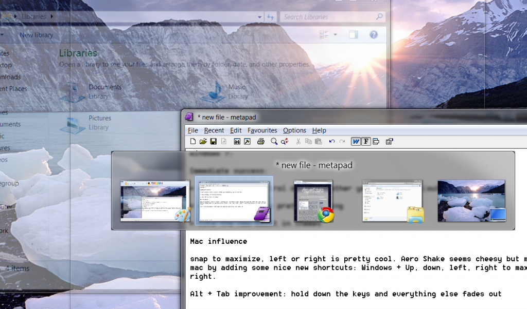
I also appreciate a minor Alt + Tab improvement: if you pause for a moment everything other than the selected Alt+Tabbed app will fade away.

Conclusion
Due to Microsoft’s long lackluster product track record I didn’t have much hope for Windows 7 but it actually feels pretty nice. Not nice enough to tempt me to switch away from my MacBook Pro running Snow Leopard. But easily nice enough for me to recommend it to friends and family who aren’t interested in Macs.
PS. And thanks to Microsoft’s blessing-and-curse of backwards compatibility, metapad seems to run flawlessly under Windows 7.
