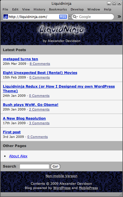
As I continue to browse the web on my beloved iPhone, I occasionally visit a blog that’s perfectly sized for the device. Basically this saves me a double-tap (which would zoom in on the article text) but anything that makes people think less is just awesome!
I recently decided that I wanted my own blog to have a similar feature: detect mobile browsers and present a different skin or theme to them. Getting this done was slightly trickier than I had expected.
An important note: if you’re using a caching plugin for WordPress you may have problems with serving different flavors of pages depending on the client’s browser. Luckily WP Super Cache, which is updated fairly frequently recently added a “Mobile device support” option for just this purpose.
First I tried the plugin called wp-mobile. This one looks just great on an iPhone. Unfortunately it just wouldn’t work for me. (Yes, even after disabling wp-supercache.) I also wasn’t a big fan of the complexity that the carrington theme comes with (since theme customization was one of my goals).
Next, I tried the much simpler MobilePress. This one just worked right out of the box with a couple caveats. First, it didn’t play well with Disqus (the cool distributed comment platform this site uses). The Disqus comment text came up the same color as the theme’s background so the comments were completely unreadable. I fixed this by changing the body background color to a lighter shade. The second caveat I’ll get to in a moment.
After MobilePress was working I decided to customize the default theme to give it the same feel of the main theme on this site, FrostNinja. (For those curious, I wrote a post on how I made FrostNinja.) To test it I used the technique described in the aforementioned article as well as simulating the iPhone on two of my desktop browsers. The picture at the top of the screen is Safari 4 with the developer menu enabled and the iphone user-agent set. I also tested with Firefox (mainly because I just love firebug!) with the UserAgent Switcher plugin.
Next comes the other problem I faced which was a bit nastier and I still don’t understand why it’s broken. I uploaded my new FrostNinja Mobile theme to my server in the correct place (plugins/mobilepress/themes) and successfully set it as the default, for all platforms, in the Mobilepress Themes setting page. But the default theme was still being served — even with wp-cache completely disabled! The workaround for this one is a bit uglier: after renaming the existing themes I symlinked both to my new theme (e.g., “ln -s frostninja-mobile default”).
Overall a fun experience and I’m pleased with the result.
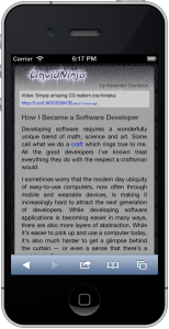
Update: At some point this mobile theme stopped working yet again. Rather than keep debugging it I turned it off in favor of a responsive solution. This has many benefits including way fewer moving parts. Here’s how it looks on mobile:

