List of Awesome

The following are some techy things that I currently think are, well, awesome. Either things that consistently put a smile on my face or just keep me regularly stimulated. (Note: the order is random.)

Instapaper

Marco Arment’s software product is actually a combination of a website, a bookmarklet and a stellar iPhone/iPad app. If you prefer to do your medium-form reading (e.g., news articles, blog posts) in a more controlled and focused manner this tool is definitely for you. For me it also acts as a general purpose cross-platform and cross-app bookmarking platform. For example when I’m reading Twitterrific on the iPhone and I see a link to something that I’d rather view on a bigger screen I simply add it to Instapaper. Similarly for NetNewsWire and probably many more mobile apps.


Daring Fireball

John Gruber’s professionally curated blog is my current favorite. It has a notable Apple focus but with plenty of general tech and hints of various other things that he finds interesting. You might think the somewhat scattered focus could make for a challenging daily read but the man has tastes that I (and likely many other readers) share.


Netflix & Blu-ray

This combo delivers 95% of my movie watching right now and although I don’t watch as many as I’d like, movies are easily one of my favorite ways to relax. The Netflix plan with 3 discs at a time seems about the right number for us right now so we haven’t really needed to delve into the streaming aspect of Netflix. Blu-ray on a big HDTV is absolutely awesome and can even make a lousy film enjoyable (e.g., if the cinematography is worthy even though the dialogue or plot sorta stinks.)


jQuery

This front-end web development technology is very powerful and surprisingly revolutionary. jQuery’s an add-on library developed by John Resig that extends the power of the web browser’s scripting language (Javascript) and data model (HTML DOM). Rarely is a library met with such enthusiasm by the web developer community. The programming style (use of CSS-style selectors) takes a bit of getting used to but results in no looking back.


iPhone & iPad

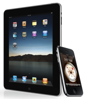
Few would not admit that Apple is at the top of their game and these two products are their flagships. From the (controlled) leaks, to the product keynotes, to the release day shipping and beyond, these are easily the most exciting and dramatic consumer technologies available right now. When I started building this list, the iPad was a new acquisition and I wasn’t sure how much I’d love it. Well, I absolutely do — it simply feels great to use and is amazingly conducive to casual computing.


Twitter

I must admit that for random, bite-sized reading entertainment and discovery Twitter is outstanding — once you put some work into figuring out exactly who to follow. My preferred twitter client is IconFactory’s Twitterrific for the iPhone. I love this app because it: a) Saves exactly where I was reading last, b) has a beautiful dark theme optimized for reading in low light, and c) integrates with Instapaper. I consider these all essential. I use the free version that has ads, not because I don’t want to shell out (I’ve paid for MANY worthy iPhone OS apps) but because I find the ads (provided by The Deck) interesting and not intrusive.


Hulu

There are a few shows that I like (e.g., The Office, Community) and Hulu, hooked up to the TV by way of MacBook, definitely does the trick. I love the Hulu app (Mac/PC) which has a streamlined interface that remembers your video quality preference and works wonderfully with an Apple Remote.


Amazon Fresh

Currently a Seattle only thing but oh, how awesome home delivered groceries are.


Windows 7 First Touch

WIN7LOGO

Although I’ve become a pretty strong Mac convert (both at home and at work), I recently took the opportunity to play around with Windows 7 for a few hours. Although Microsoft as a whole fails to impress me these days, there is still a small soft spot in my heart for Windows. I was especially interested to see what kind of user interface improvements were added to this version; Vista was pretty lacking in that department.

Immediate Thoughts

  • Installation was painless and quick
  • User Account Control doesn’t bother you every few mins. Woohoo!
  • For once, most of the built in themes look nice
  • Ugh… the sound effects are rather awful
  • Glad to see the widget sidebar go away (you can still add widgets anywhere)

The Taskbar

The new improved taskbar is easily the star of Windows 7’s UI — a much needed upgrade of an ancient feature.

Microsoft has obviously taken some cues from Apple as this new improved taskbar resembles the OS X dock in a number of (good) ways. The most obvious change is that running apps all show up as an icon without a title. Apps can be “pinned” so that they stay on the taskbar even when the app is not running. Running apps are each subtly highlighted. And you can (finally) reorder running apps by dragging them. Doesn’t this all sound familiar?

Win7's taskbar
Win7's taskbar
OS X's dock
OS X's dock

The smaller size of each app makes the taskbar better suited for running many apps at once. Also notice that windows that stack are visually represented (in the image above IE has two tabs open). Subtle yet effective!

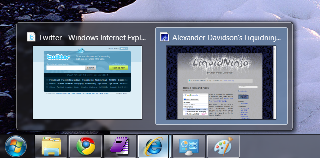
I was quite impressed with the hover popup for Internet Explorer (see image below). This is arguably more intuitive than Snow Leopard’s exposé because you don’t need to click and hold — you just hover. And you can navigate right to a particular tab within that app (although it isn’t supported in Chrome or Firefox at the moment if ever).

taskbar
Taskbar app "tooltip"

Another minor but welcome Mac OS X influence to the Windows 7 taskbar is the monochrome system icons in the tray.

Win 7's monochrome system tray icons
OS X's system menu icons

Other Stuff

The new Aero Snap is interesting. Basically dragging a window to the top of the screen will maximize it. Dragging it to the left or right edge of the screen will cause the window to take up that half of the screen. Dragging away restores the original size. I was worried that this feature would be cumbersome but in fact it works pretty well.

The usability key here is that it doesn’t trigger the snap when the window touches the screen edge. It happens when your mouse cursor hits the edge (and to make this “magic” more evident to the user the mouse pointer glows when the snap is triggered).

Aero Shake, where you shake a window with your mouse cursor to hide every other window, seems cheesy but might be useful for some people. I envision frustrated Grandmas shaking their entire laptops.

As a keyboard junky I really love the new window manipulation shortcuts, especially Windows + Up, Down, Left and Right to maximize, minimize or snap left and right.

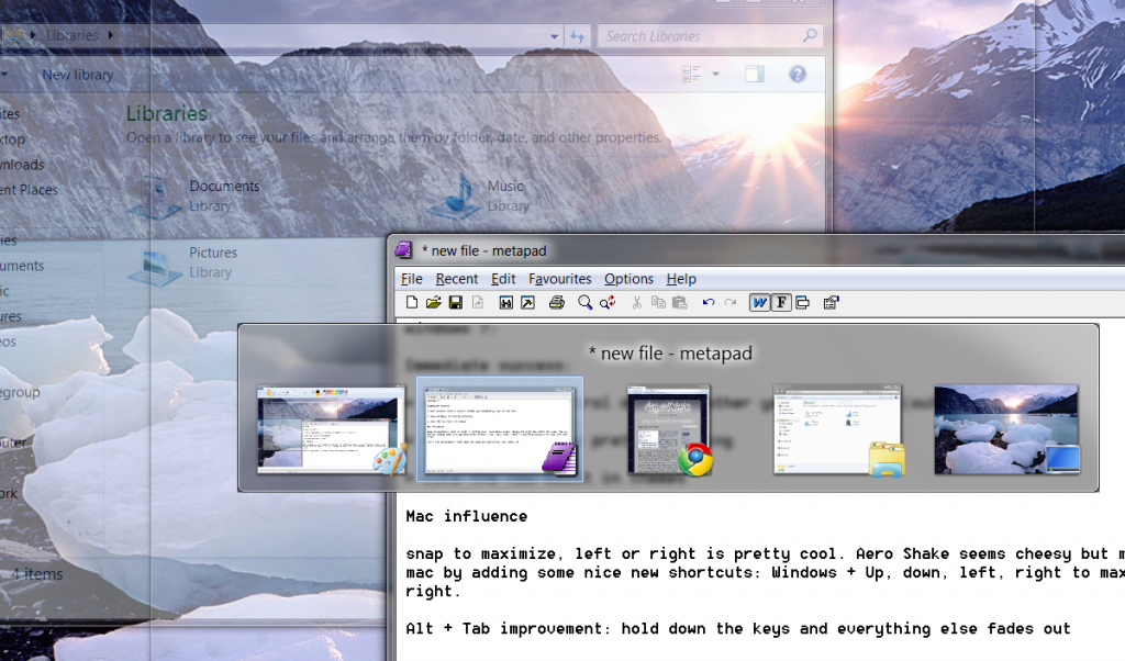
I also appreciate a minor Alt + Tab improvement: if you pause for a moment everything other than the selected Alt+Tabbed app will fade away.

alt-tab
Alt+Tab now makes other windows transparent (simulated screencap)

Conclusion

Due to Microsoft’s long lackluster product track record I didn’t have much hope for Windows 7 but it actually feels pretty nice. Not nice enough to tempt me to switch away from my MacBook Pro running Snow Leopard. But easily nice enough for me to recommend it to friends and family who aren’t interested in Macs.

PS. And thanks to Microsoft’s blessing-and-curse of backwards compatibility, metapad seems to run flawlessly under Windows 7.

Blogs, Feeds and Pipes

modified-reader

While it appears that blogging is alive and well, some are of the opinion that feeds and feed readers are dying.

And lately I do find that I spend increasing amounts of time consuming tweet streams on my iPhone which means less time in my trusty Google Reader.

But when I do find some time to spend in Reader, the quality, depth and speed of my information consumption is so far superior to anything else I know of on the net. The main challenges with Reader are knowing what feeds to subscribe to (and unsubscribe from) and constantly re-sorting so that you can easily read your favorite feeds first. (The same thing can be said of Twitter to a large degree, minus the sorting).

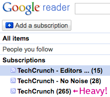
Love him or hate him, Michael Arrington’s TechCrunch is arguably a premier news source and usually one of my daily favorites. But it’s a medium- to high-volume blog and recently I’ve found I simply couldn’t keep up with it. I generally enjoy posts written by Arrington as well as most of co-editor Erick Schonfeld’s. I also like about half of the rest of the staff writers there and sometimes the guest posts are worth checking out. Their blog does provide individual feeds for each of the writers but that approach would get me too many feeds and I’d miss out on any new staff and guest writers.

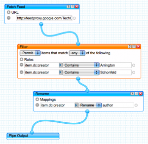
To solve my problem I turned to Pipes, one of Yahoo’s most interesting offerings today. Pipes offers a visual interface to allow you to slice, dice and even glue together any feeds on the net. (It uses HTML5’s Canvas feature to provide an impressive graphical UI.)

Pipes' Sweet Editing Interface
One of my hacked TechCrunch feeds in Pipes' sweet UI

With Pipes, I created two filtered versions of TechCrunch: Editors Only and No Noise. The Editors Only feed (pictured above) contains only posts by Arrington and Schonfeld. The No Noise feed filters out some of the writers that I find report on more mundane stories (it also filters out the two editors so I don’t have dupes). The reason I created two separate feeds is to provide more granularity for my feed reading priority list.

One annoying bug that I discovered on my first attempt at these pipes was that the post author’s name wasn’t showing up in Google Reader. Luckily I worked out a fix for that: add a rename mapping for “item.dc:creator” to “author”. Another minor annoyance with Pipes is that they don’t seem to refresh nearly as often as the original source feeds (e.g., expect up to an hour delay). But that I can live with as I simply don’t have the time to refresh my feeds all day waiting for something new to pop up.

With my two new “piped out” feeds I’m now able to keep up with TechCrunch without spending nearly as much time tapping the j-key in Reader.

Lifetracking with Nike + iPod

nikeplus2Lifetracking is becoming a popular trend with the tech crowd. Although I’ve never been one to keep a journal, having gobs of personal data to track my own life trends is attractive — as long as it is relatively painless to gather.

I hadn’t heard of the Nike + iPod system until I found the tucked away setting in my iPhone 3GS and then happened read a good Wired article on it. In brief, the system will measure and record your run or walk workout including distance, time and calories burned while letting you listen to music and giving you audible workout feedback. Then iTunes will sync your data to the cloud so you can follow trends. The article inspired me to give it a go but this little experiment would require a few small purchases before I could start.

Setting Up

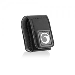
I’ve been into running off-and-on for about 7 years now but haven’t ever had much luck integrating a music player into my routine. My manager recommended the Tuneband ($13) which is a rubber glove for an iPod and a velcro strap for your arm. Seemed simple enough so I picked up the version for my 8gb iPod Nano G2.

Next I ordered the Nike+ sensor kit ($29). This comes with a sensor for your shoe and a small receiver for an iPod. If you have a newer iPod Touch or an iPod 3GS the receiver part is not needed (it’s built in already) so you could save 10 bucks and get the sensor alone. But the thought of running and lugging an iPhone versus a light Nano was a turn off — unless you’re single or in sales and need to be on the grid 24/7. One side note is that the unboxing wasn’t very pleasant — obviously Apple didn’t design this packaging.

The last thing I needed was something to affix the sensor to my shoe. One could simply do as Nike intends and get a pair of compatible Nike+ runners (which have a special compartment under the insole). But since I haven’t worn Nikes since grade school (Agassis FTW!) this dedicated New Balance guy needed something else. After researching online I settled on the Marware pouch ($9) which looks pretty slick and works great. Simply insert the sensor face down (this is critical) and strap tightly to your laces. Ready to rock!

Marware's shoe pouch

The Tests

My first test consisted of a brisk walk to the post office on Saturday. I was more interested in running but I had a pack on my back full of packages to mail so a brisk walk would have to do. I picked a playlist (Oakenfold’s latest) and set off and everything just seemed to work.

On Sunday I tried a short run. I decided to skip calibration because I thought I could do it after the workout. Unfortunately after my run I found out that is only possible using a G4 Nano or a Touch/3GS — annoying. I later used the awesome Gmap Pedometer to measure my run distance and it turns out the Nike+ was off by about 10%. I hear this error is somewhat enhanced when you use a shoe pouch so for my next run I’ll do a proper calibration by running a known distance.

At one point early on in my run the workout stopped because the sensor got dislodged (either by the tuneband case or by not inserting it fully). This resulted in one actual run being split into two workouts which is a little annoying. Unfortunately there is no way through the iPod software (or later through iTunes or Nike+) to merge two workouts into one. Next time I’ll try having the iPod upside down in the Tuneband so the sensor is at the top. I think it may be easier to read the screen that way too.

Impressions

The first notable feature is the pleasant female voice feedback (male is available too) that fades into your song and reports your current time, distance and pace (cool!) whenever you hit the center iPod button. There is useful pause option if you get stuck at a red light or want to stretch. They also added a nice touch when you beat your longest workout record: a famous athlete’s voice will congratulate you.

The Data

Picture 3
One part of my first Nike+ run

You can view some workout stats on the iPod itself but when you next sync it with iTunes, you’ll be asked if you want to upload the data to nikeplus.com. It’s pretty easy to get going but you’ll then need to create an account on the Nike website (ugh, more spam… I mean marketing opportunities). The Nike website immediately shows your latest run in detail and it’s pretty cool to see your running speed tracked over time. Unfortunately the site is all Flash and it’s usability could stand to see some major improvements. It also has lots of social components like public goals, contests, avatars etc. which aren’t too appealing to me at the moment.

I’m not sure I love the idea of a sporting goods company storing my personal lifetracking data. I found another online option called runnerplus.com which is supposedly more advanced but also very social. But since all of the pedometer data is stored on the iPod in XML (you can find and even edit it if you want to) there are other options such as the Neki++ open source desktop app that I’m eager to try out. I’d love to find a self hosted, open source web app so I can both own my data and easily share/compare with friends and family.

Overall this product is very cool and adds a new dimension of fun to walking and running. I’m looking forward to using it some more and I wonder if it will introduce a beneficial Hawthorne effect on my exercise regime.

Update (8/8/2009)

My next run was more successful. Before I started I used Gmap pedometer to measure exactly 0.25 miles and then ran and walked it to calibrate. This corrected the Nike+ by about 15% for both walking and running! I also tried wearing the TuneBand upside down which worked out very well.

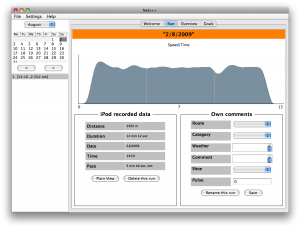
The Neki++ App
The Neki++ App

Later, I used Neki++ to pull and display my workout data locally. It doesn’t have a lot of polish visually or feature wise (e.g., no way to switch out of metric measurements) but it worked without a hitch and provides much of the same workout functionality that the Nike website does — without having any data privacy issues.

My iPhone’s Getting Blue

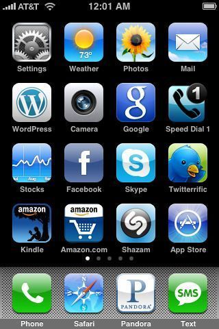
I am eagerly anticipating a new iPhone 3G S (and OS 3.0) later this week as I write this post on my still excellent first generation iPhone. I am brewing a separate post about mobile phones but I wanted to share a brief observation: most of my favorite apps have blue icons.

A few blue apps worth mentioning:

WordPress – using it to tap out this post in bed right now

Pandora – plug into your stereo and be amazed!

Twitterific – an excellent, powerful Twitter client

Shazam – great accuracy at identifying songs playing around you (I’ve discovered neat stuff on the radio with this one!)

Google – voice search can be super fast and easy. Trying to train myself to use it more.